A website redesign is a major move that could impact not only the overall look and functionality of your site but most of all, your standing in search rankings. Because major redesigns and adjustments are very likely to affect your website’s optimization, it is extremely important to invest in a proper audit to know up to what extent your redesign is going to impact your search standing. While redesigning your site can definitely impact your website ranking, it can also be seen as a great opportunity to improve your visibility because after all, SEO should start right at the core of your website structure. Here is a quick checklist you could use to avoid a disastrous slide in your web rankings when redesigning your website:
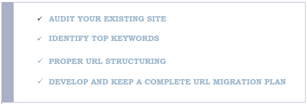
- Audit your existing site. Before busting out that wrecking ball and crushing your old site to pieces, take time to examine its framework and determine which of your SEO efforts have been keeping you alive in searches and which are not as effective. Some key metrics you should consider include your number of visitors and unique visits, your top performing keywords (traffic, rank, and lead-generation wise), inbound link domains, number of pages that receive traffic, and number of pages that are indexed by search engines. Thorough knowledge of these factors and elements will help you make informed decisions about which pages are worth keeping and which could easily be taken down and rebuilt without having too much of an impact on your rankings. This will also help you determine which pages can be salvaged, or simply revamped and reorganized during the redesign.
- Identify top keywords. No matter how SEO has developed and changed over the years, one thing remains the same—it is still very much reliant on keywords. While it is not advisable to stuff keywords into your content to achieve ranking success, you still need appropriate key terms to capture your audience. Keywords are still as relevant to search as it was during keyword-stuffing days, only you have to be mindful how you use them. Google is more concerned about high quality content today than they are about keyword density and repetitions. As much as you can, work keywords naturally into your content and your pages so that they can contribute to your website’s relevance within a particular subject.
- Proper URL structuring. Lengthy, symbol-ridden, and indecipherable URLs that don’t help much in identifying the subject of your website pages should be restructured so that they show exactly what readers and visitors can expect from their content. Search engines increasingly try to imitate actual searchers’ behavior and users prefer URLs that make sense and are easy to understand because they lead them right to pages that matter. Use dashes instead of underscores as separators because Google treats them as such. Underscores, in the eyes of Google bots, are connectors, which means website_redesigning_tips is likely to be read as websiteredesigningtips, affecting the page’s position in searches for the same topic.
- Develop and keep a complete URL migration plan. To ensure a smooth transition from your old site to your new and improved site takes place, you need to thoroughly review the old site to create a mapping report which shall include “new” URLs for pages whose URLs are going to change with the re-design. This is one of the most, if not the most important task that needs to be completed during any site re-design. Mapping old URLs to new ones and then 301 re-directing them as soon as the new site is launched means preserving the rankings & links value of those important pages.
- Mobile optimization. Most redesigns nowadays are done to make websites more mobile-friendly. With users accessing sites in differently-sized screens, website owners need a more proactive and responsive solution that allows their pages to be viewed properly through varying platforms. A responsive design is definitely your best option if you want to deliver superb search and surfing/browsing experience to your largely mobile users. A responsive design means better access across different devices and optimized experience across differently sized screens, which is simply impossible for websites that are still stuck with old browser and screen-biased designs.